Røyksopp album art
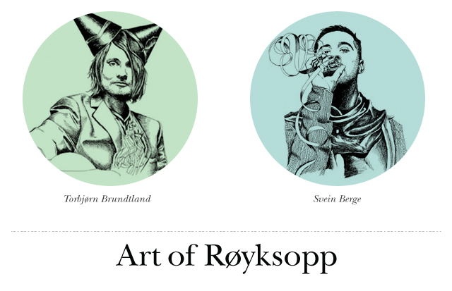
Following Røyksopp for ten years is wildly rewarding. Prior to being fully connected via iTunes, I remember standing in a music store in the suburbs deciding which album to buy in the “world electro” section. Obviously if you follow these guys you know they blow that section away and deserve a title of their own. Even comparing them to their compatriots they’re usually lumped with in the Bergen Wave, Røyksopp defies grouping. So there I stood, rocking back in forth, several plastic-wrapped albums in-hand. Their cover art of The Understanding completed the purchase for me before I realized it. Hallelujah for art-lead discoveries of musical wonderlands.
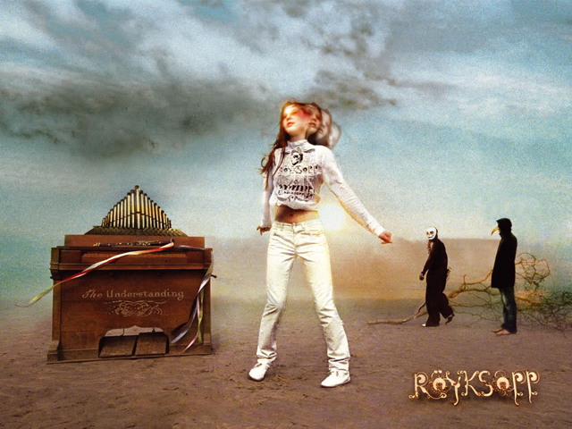
My first exposure to Røyksopp in fact wasn’t The Understanding, but this is what I held in my hot little hands the day I realized I had found a new gravitational force in my musical experience. A follow up to their 2001 debut album Melody A.M., The Understanding’s album art was a far more magnetic and probably polarizing experience. By this time I had known that the two gentlemen responsible for these sounds were from a tucked away portion of Norway (which feels tucked already) and I appreciated the bleak & hallucinogenic qualities of the imagery chosen. Additionally, I had not noticed or been exposed to expressive type before and their in-situation alien appendage inspired letters had me totally hooked.
In fact looking at this album cover is not understanding, contrary to the title. But upon play it is. Is this dance music? Is it chill? How on earth does this fit in my life? It’s a little too loud for company, not quite meant for the dance floor, well produced but nuanced to the hilt. And why can’t I keep track of the vocalists?
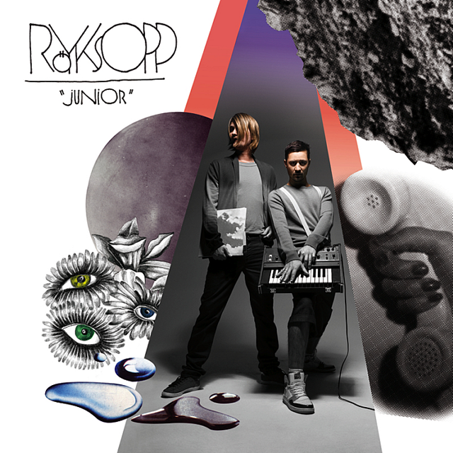
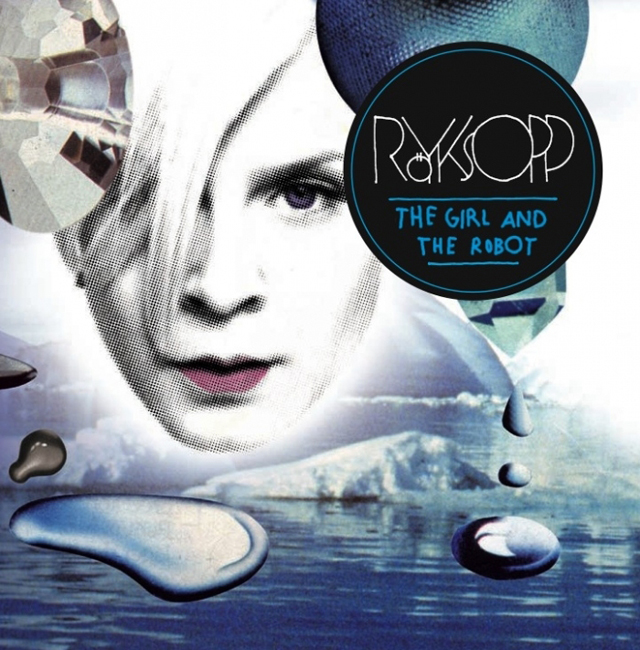
The Understanding worked well for Røyksopp. Their global audience became self aware, but the top 100 crowd never really paid much attention. The quality of expression and imagery appropriately changed when in 2009 Junior was released. The track The Girl and the Robot was sung by Robyn and some argued it was the best song of 2009.
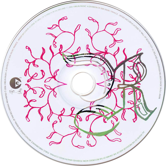
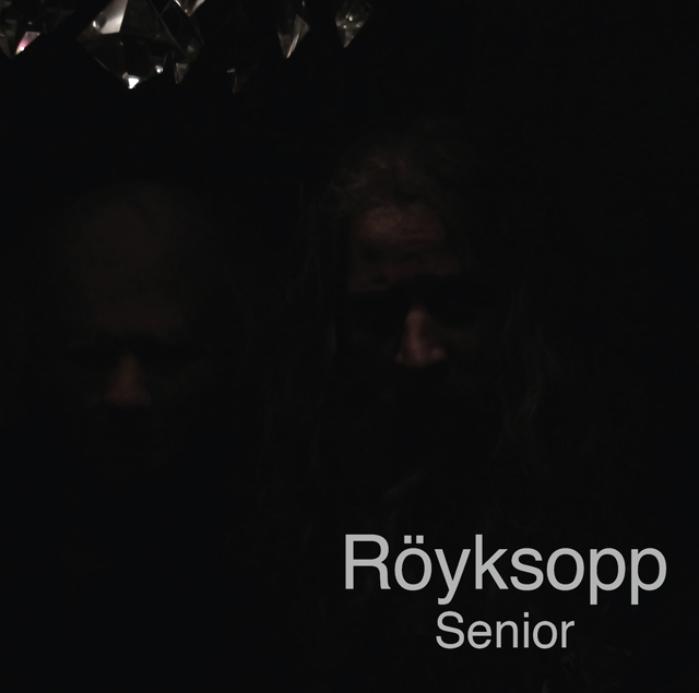
In 2010 the duo released Senior, which was their most nuanced album to date. In fact Senior was to play off Junior’s feeling of unbridled adolescence and respond to it with a sense of responsibility and restraint. Comparing the two album covers reveals that the two see themselves as aged, as well as their musical expression. The following clip shows a track from Senior and its odd, offbeat, and mildly disturbing, distinctively Røyksopp style.
Displaying the artist name in fire and the track title in graffiti would have made any of my typography teachers absolutely squirm in delight (you know who you are). I really enjoy how clean and primped these girls are despite being in a zombie apocalypse set in what looks to be Chernobyl. Thanks for what you do Røyksopp. And for hiring talented art directors for your albums.