The books in the Fort
I was asked recently what I was reading, but not in the sense of “currently.” I think I was being asked what books I turn to when I need to. I’ve got a few standards, a few golden pages that continually intrigue, pay off, and illicit. I don’t exactly read these, but I study them. Design reading is a different category, and probably a boring one. I’ll also mention that it just started snowing outside, the first of the year on the valley floor here in the Pacific Northwest. Great time for a post!
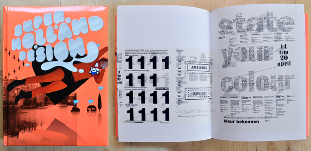
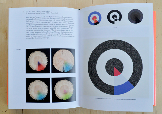
Super Holland Design is a follow up to Holland Design, first published in 2001, and explores contemporary Dutch design & art direction. The incredible thing about this book is that it is bursting with ideas, rather than treatments. It is an art director’s dream, a jolting step into the world of visual communication. Each time I crack its puffy neon spine I find a new source/thought/idea and it absolutely thrills me.
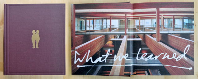
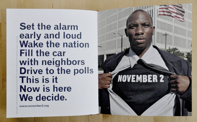
The next one was done here in Portland. It is the first book from the first year of W+K 12 entitled What We Learned. The front cover holds a gold foil stamp of Dan and David standing back-to-back, and one of the first spreads is a photograph of the upper floor of Wieden + Kennedy with type scribbled across it. The book contains all of the work done in the first year of 12, and what a year it was.
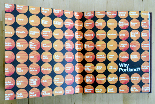
I love the Why Portland spread, and all of its answers. Timber Jim! That particular one has special interest to me now, as well as DIY, Old Town, Little Big City, and Walking. Ok the whole spread is incredible. The November 2 work also is incredible, if you want to see the TV spot that accompanied it, watch it here, directed by Jelly Helm.
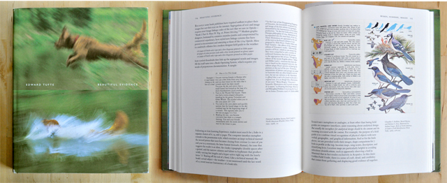
A. How could I not include Tufte and B. how could I not include a Tufte spread with birds? Well ok, this is standard, I realize, often assigned to students studying information design, but that cover! It’s one of the books that when set out people can’t resist to pick up. Who would put a blurry photograph on the cover of a book? Who would put two?
Tufte is so required that I never put him back on the shelf. Any of his works will do, I chose to show Beautiful Evidence and was happy to find it later assigned in more than one class I’ve taken. I do recommend just purchasing the bundle along with Envisioning Information and the Visual Display of Quantitative Information if you know what’s good for your grey matter.
In particular within these pages you will find the most exhaustive and brilliant break down of what is probably the most famous information graphic in the world. Tufte hands you Charles Joseph Minard’s data map that represents French losses during the invasion of Russia in 1812. In such a way that no one else could, he explains the implications of every line on that map, and allows the reader to take away the skills needed to convey data-rich visualizations. Invaluable resource.
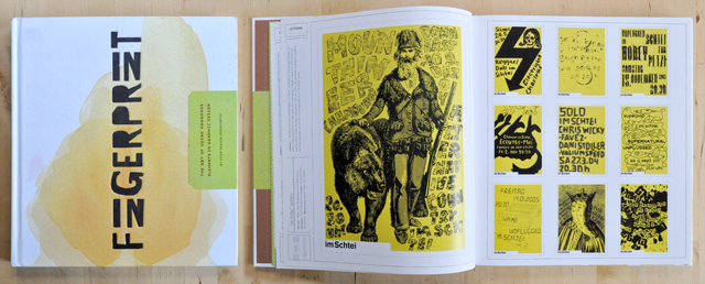
Many people know of this book, it’s fairly common. Fingerprint is not just a DIY book on how to make crafty junk. It has real solutions that designers can integrate and manipulate for any sort of project. Beyond awesome how-to’s it’s just a good starting point for generating ideas and ways to approach upcoming work. Plus, I actually did stain my cover and no one will ever notice (mid-left at spine)!

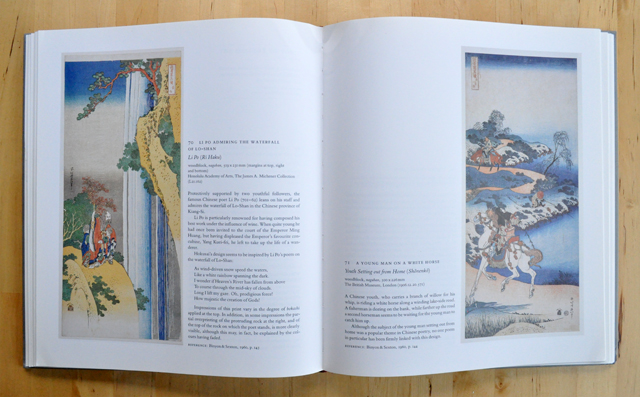
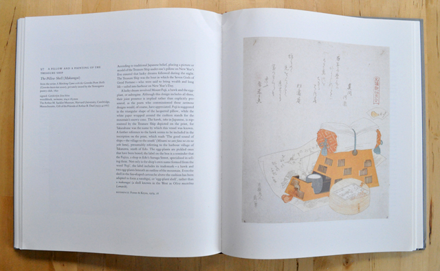
Japan’s most famous artist can be traced back to one of Japan’s most famous images, the nice thing about this book is that it’s barely mentioned. Spanning his entire career, Hokusai: Prints and Drawings is exhaustive, informative, and incredible. Also a little perverse, with some scandalous prints depicting naughty things, in oh such a refined manner. This was actually my first book of art, I’ve had it for so long I don’t recall how it came into my life. Perhaps as the best present ever? Perhaps I found it as a child stumbling through the halls of Powell’s. I have no idea where my dust cover is either, but I recall it wasn’t that great anyway.
I used to try and recreate some of his waterfall prints with acrylic paints on canvas. An absolute disaster, I learned how to mimic, interpret, and also get frustrated with my inabilities. On composition, balance, and pattern, this book is pure poetry. I remember realizing that I first had an emotional response to art within the pages of this book. Complete treasure.
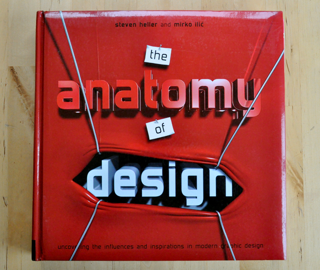
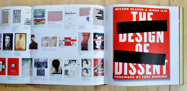
Another puffy book! It may be squishy to the touch but open it up and revel in the sheer amount of design history. Alright so each page in this book is a fold-out. On the far right is a contemporary design piece, and the fold out shows its complete graphic history. Basically how we got to the point of the contemporary piece. Some of the precedents go back thousands of years, many to the early 1900’s. It is such an excellent concept for a book, I cannot imagine the amount of research this required.
The Anatomy of Design isn’t something I pull off the shelf too often, but when I’m looking to begin thinking how to approach a problem it is a great way to see what has come before me. The combination of what has been done along with my own cloud reading and dream sequences seem to be a nice spark for something newish.
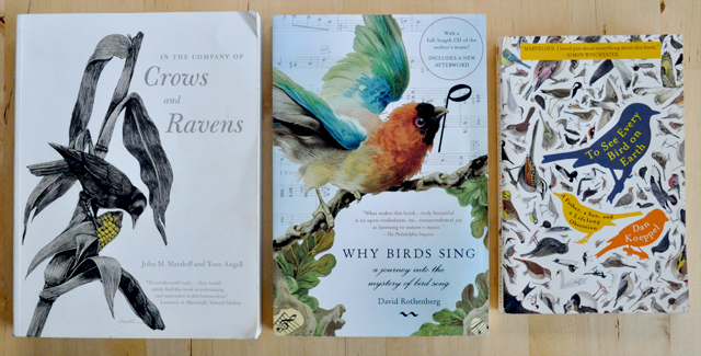
How could I not?
I’ve a shelf for this subject, and these 3 above have many friends. If Hokusai can paint One Hundred Views of Mount Fuji, I can have bird books coming out my ears and write in my Birders Journal. We all need a few obsessions.
Thanks for this post Aaron!
I think I will need to hit up the library soon and look into the design section like you mentioned!
p.s. I think I have a new Christmas list thanks to this post..