Color.
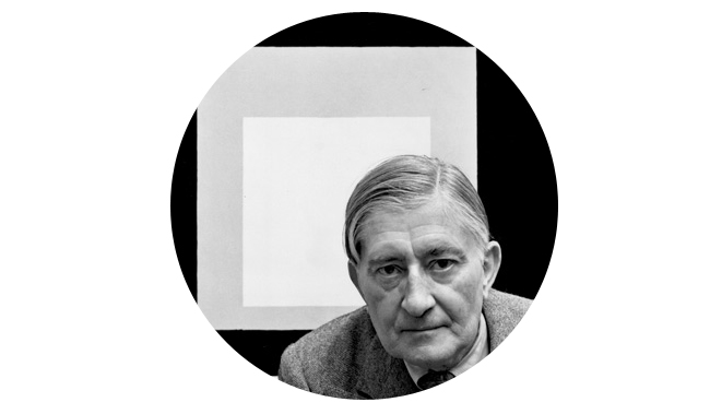
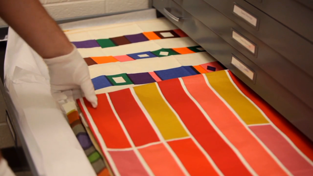
Well these two little videos will just make you want to give Kate Bingaman-Burt a sloppy wet kiss and or a bear hug. Especially when in the first video some serious textile drawers are opened. Aaron Britt at Dwell Magazine is knee-deep in a series on color called Full Spectrum which is being shot by Gary Nadeau. One part of this awesome little series takes place at the Albers foundation in Connecticut, where lovely anecdotes can be viewed in regards to the late master of color. Quite a few people already know of the series, but in case you’d not heard or seen pieces of it, I highly recommend it for your mental health. Even if you aren’t into design, color theory, or the fullness life can offer you. Watch these, they are wonderful. And the music is done by Wonderful!
Susan Lyons over at Herman Miller had some great insight on color & the practice of “choosing” colors for things that are designed to be functional, not trendy.
“I think the issue of context is really, really important. Because the object never is sitting alone in a room, it’s always residing with other things.”
“The Eames’ talked about this idea of ‘the way it should-be-ness’ as a quality, that you would make things and keep making things and keep iterating until you knew you had it the way it should be. It wasn’t a sort of prescriptiveness, design is an iterative process where you are constantly exploring and you don’t really want to know what the end result is. It’s about exploration.”

“Alexander Girard felt it was important to have color around you, to have pattern around you, because it was nourishing. And people absolutely loved it.”
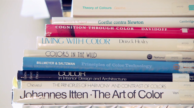
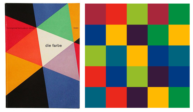
I recall during the first year of design school studying the work of Johannes Itten from his landmark book The Elements of Color (which is actually a condensed selection of The Art of Color, seen above). Specifically, Itten took students and readers through a series of exercises executed in checkerboard pattern swatches based on various color harmonies. At the time I remember reviewing these and thinking that there was really nothing special about these checkerboxes and that honestly matching colors was just a matter of using the eyedropper tool. Luckily I kept my book (as all students should, at least if they are in the design department) and flipping through it today I find myself continually shocked at the excellence displayed there. When done correctly, a checkerboard can just knock you off your rocker! How is it possible that these colors can be so relevant, modern, subtle, and jolting at the same instant?
The second video in this series takes place in Soho at an off-the-rack clothier called Seize sur Vingt and its CEO James Jurney. Within the context of clothing and expressing yourself through what you choose to put on your body, James explains how his shop came to be in the 90’s when everyone was wearing kakhi’s and blue dress shirts. It’s great how this short spot basically explains the purpose of the neutral suit, and how to paint within the confines of, say, the grey workers suit.

I just completed a color trend project btw so I can definitely relate. Most people don’t realize how complex color can be, especially when your applying it to a specific material, in a specific context.
oh, I just love this, Aaron!
Excellent!