Badge design & inspiration
Badges are pretty much everywhere.
Some people aren’t willing to call them logos, arguing that they’re just a trendy piece of graphic eye candy, soon to be dated, and not really worth pursuing in your own work. Others think they’re beautiful and should be plastered on everything from skate decks to the Lakes of Minnesota. Recently there was a blog post from Allan Peters curating his favorite badges of the internet, which has strangely disappeared. Where did this post go? Anyone have a lead?
Since it’s gone I decided to make one of my own, with a bit of a study on what makes these little marks nice to look at, and perhaps a challenge on how to move forward. Not wanting to waste time on trendy graphic treatments, it is important to recognize what’s being made, and how to make it our own (which is to mean at times, better). In this process we then need not worry about our work becoming dated, only about using successful elements of design and applying them to our work through our way of seeing the world. Foundations!
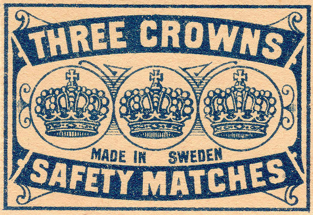
It appears that many elements of the badges we’re seeing today can be found in 19th century advertisements like these:
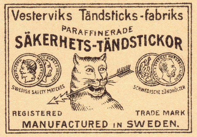
This may or may not qualify specifically as a badge, especially considering the bounding rules which makes me think it’s an ad from a newspaper or catalogue for safety matches, but the elements are there. A balanced approach to all the elements, as if hanging from a middle pole – the iconography is surrounded by type-on-paths. There is a ton of type here, and I’ve seen badges with what seems like paragraphs of type contained within them. In fact the badge allows much more room for type than a traditional logo does. Perhaps this is part of their main advantage, the ability to express typographically.
Some logo designers would call this a crutch, as it’s more difficult to express ideas and concepts visually. Hence, the craft of logo making and why it has value. Does the badge undermine this value?
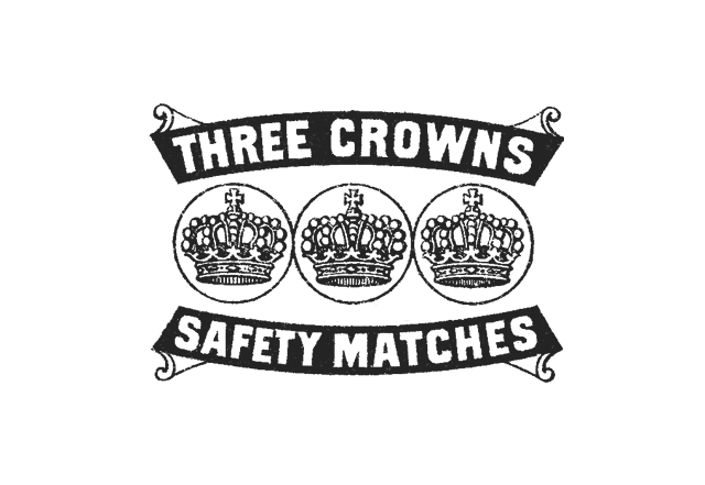
Another similarly dated pice begins to show even more elements in use over the last couple of years. Banners or ribbons containing type, elipses-bound icons, and an ovoid composition. Keeping these elements in mind as you scroll through the badges below will help identify visual trends across most of the treatments. This example above is particularly reproduced in terms of type choice. Take out the bounding rule, the ornamental lines behind the crowns, and you have something that could have been made in 2010.
A couple more examples of graphic elements from over a hundred years ago that are used today in badge design:
![]()
If you can look past these subjects, the treatment is largely the same. Add some type outside those elipses, something all caps, perhaps a stacked Gothic with an inner stroke and you’ve got the beginnings of a badge. Heraldic icons especially seem to be popular, along with the accompanying shapes. Shields, circles, crests, chevrons, boy-scout or military-inspired nuances, and type-on-paths all play together in this trend.
For now, let’s just look at some straight black and white badges with these elements in mind. Side note: All of these images and their sources can be found on my Designspiration saves.
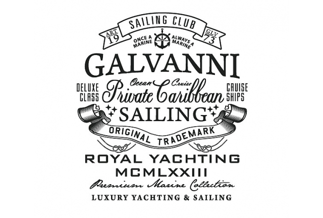
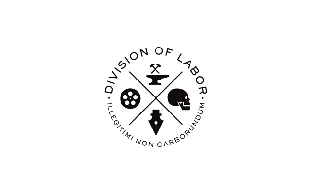
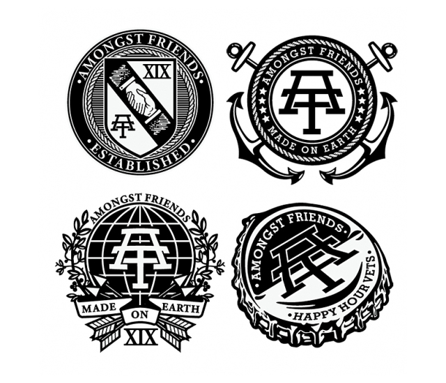
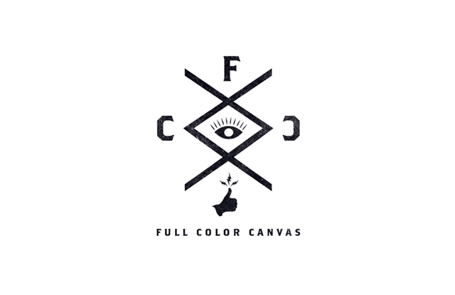
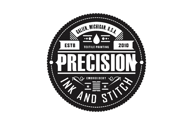
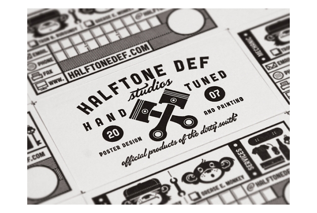
Now I’m realizing that this post is going to be huge. Nothing like an exhaustive resource, right?
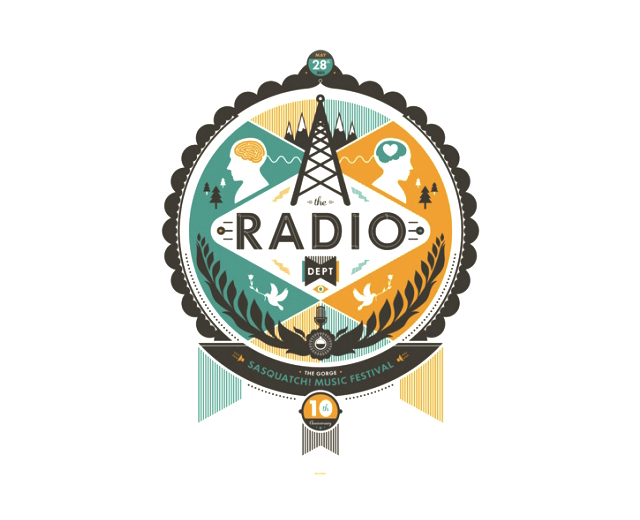
Ok let’s keep going campers, and let’s add some color. Looking at these it begins to be clear that many of these badges would not work as traditional logos, there are so many small elements that just would get lost at smaller sizes. So perhaps the badge is an internet-logo? Not to be seen in print? Who knows.
Ok everyone still alive?
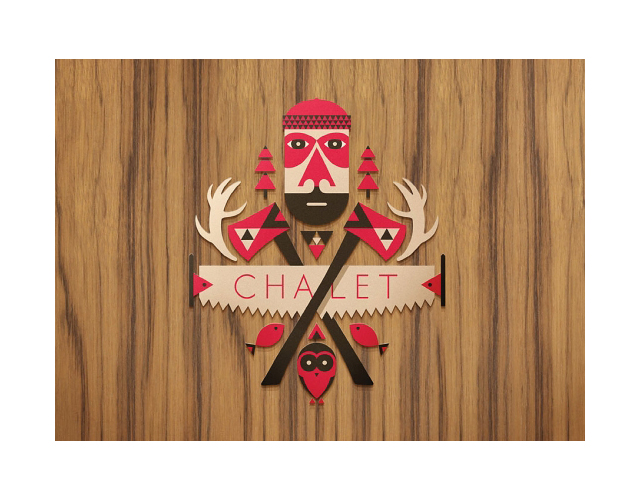
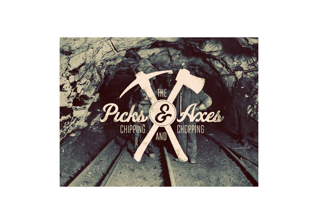
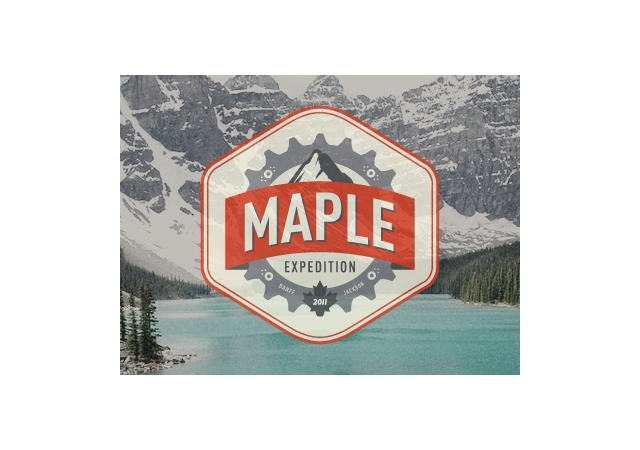
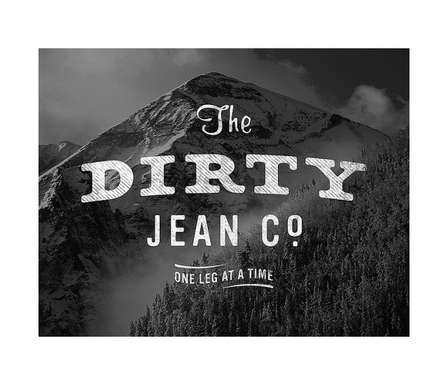
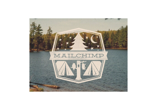
The final installment of this badge inspiration mega post is the badge upon image. When the right image is placed with the right badge there is a bit of magic. The sad thing is their uses are a little limited, but they’re awesome nonetheless.

Safe to say I want to create better badges now.
Badges are pretty! Nice post
I’ve seen most of these marks, all beautiful. Excellent curation, Sir.
Thanks for the fun graphic trip. I’m unapologetic in my reliance on the badge convention. Badges rule. They look official because they ARE OFFICIAL. The badge makes it so.
Nice job pulling these images together!